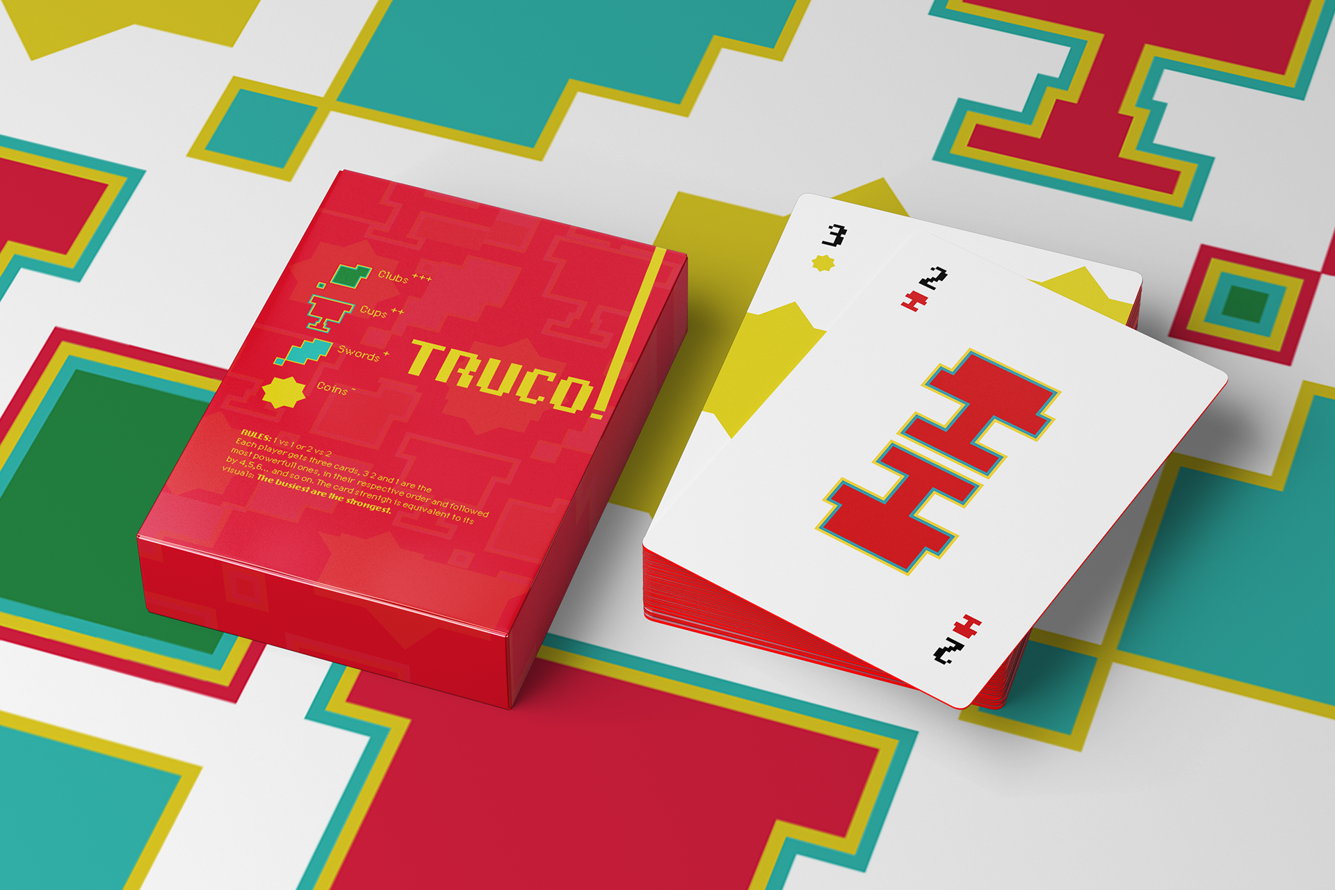
Truco is a Brazilian card game with Spanish roots, based on bluffing and strategy, usually played in two teams of two. The goal is to win 12 rounds by having the best card combination or bluffing your opponents into believing you have stronger cards than your actual hand. Different versions of it are played all around the territory, with the French deck or Spanish that has numbers instead of J, Q and K. For this game we use 40 cards and not the full deck of 52, since there are no 8’s nor 9’s.
Every round each player starts with 3 cards. The players start taking bids (loudly) indicating the strength of their cards, which it could be a lie. The bid “Truco” is worth 3 points, the others have the name for numbers in Portuguese: “Seis” is 6, “Nove” is 9 or “Doze” that ends the game, since it is worth 12 points. So you must slide enough to accept the bid or run, guessing if the person is telling the truth.
One unique aspect of Truco is hand signals to tell your partner which cards you have. Subtle winks and gestures to indicate what move you will take, helping your partner if they don’t have good cards to kill their opponent’s card.
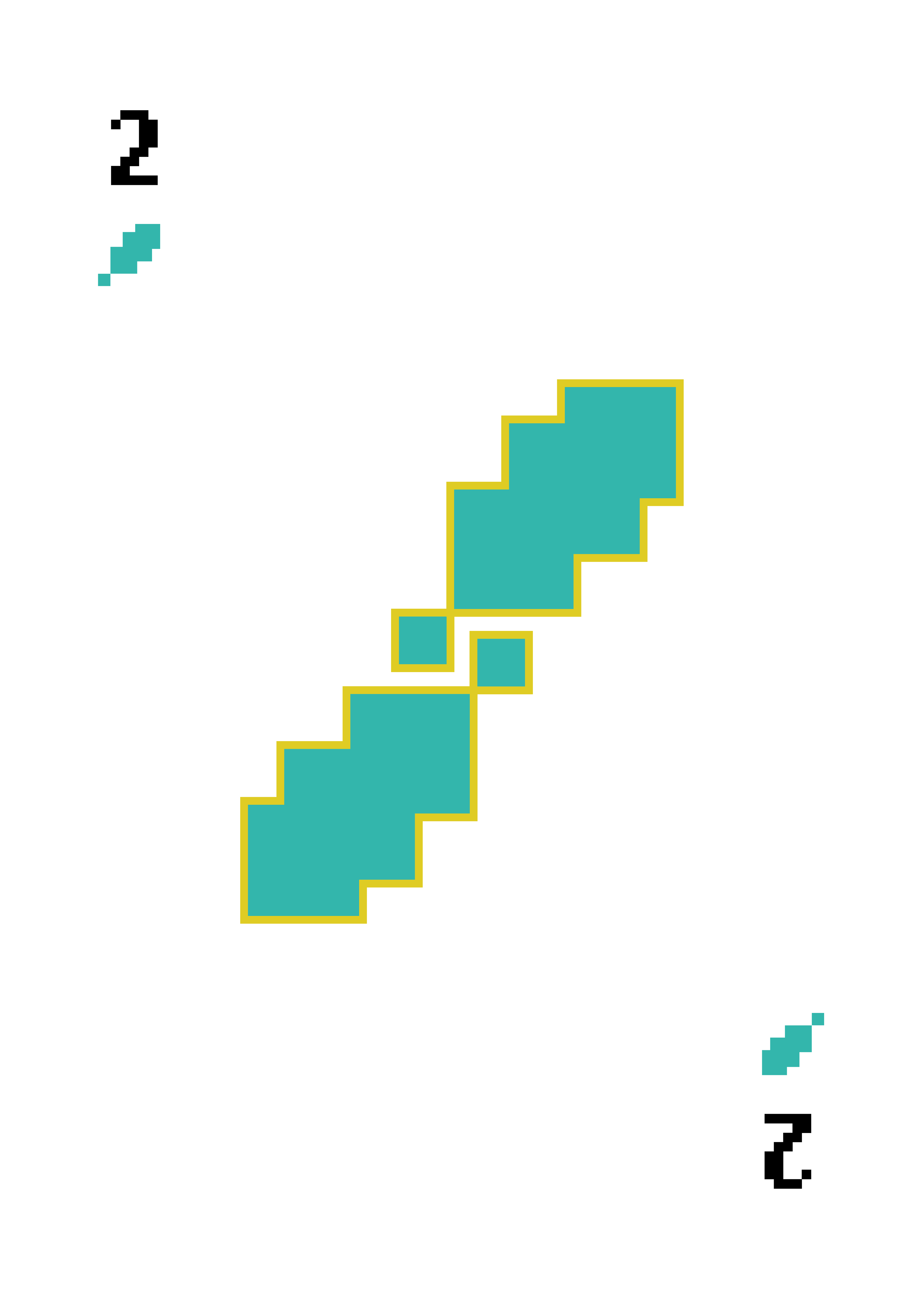
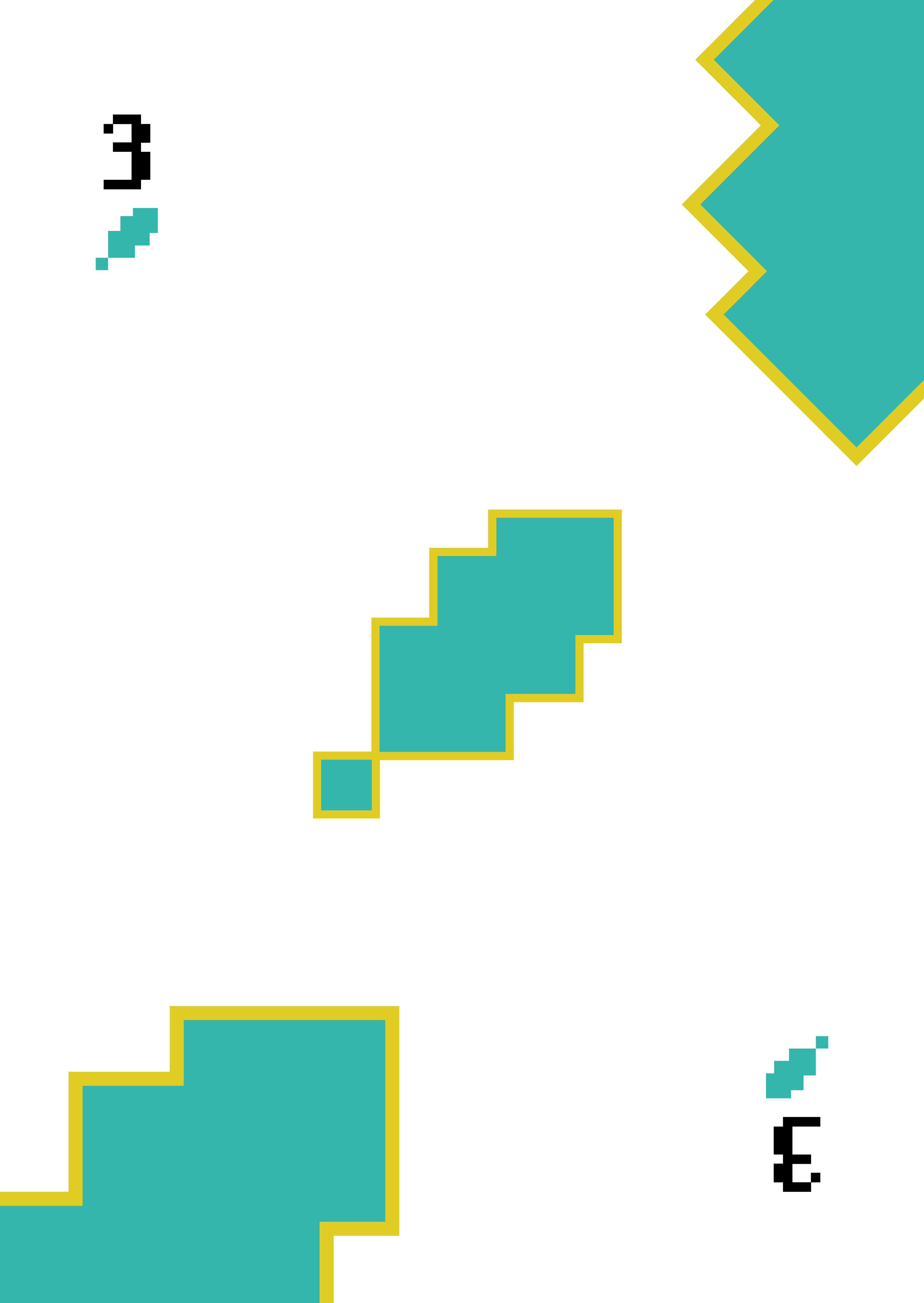
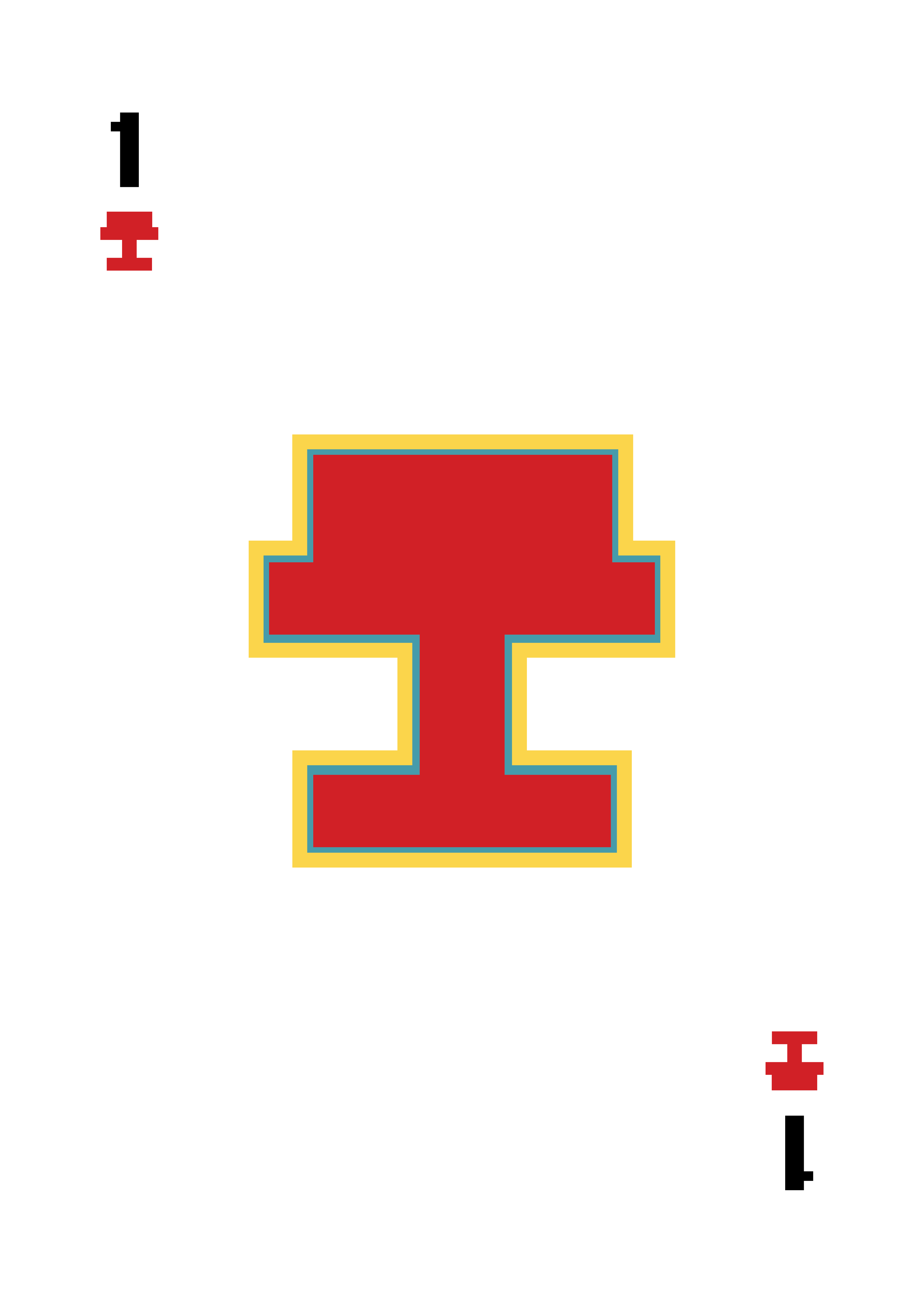
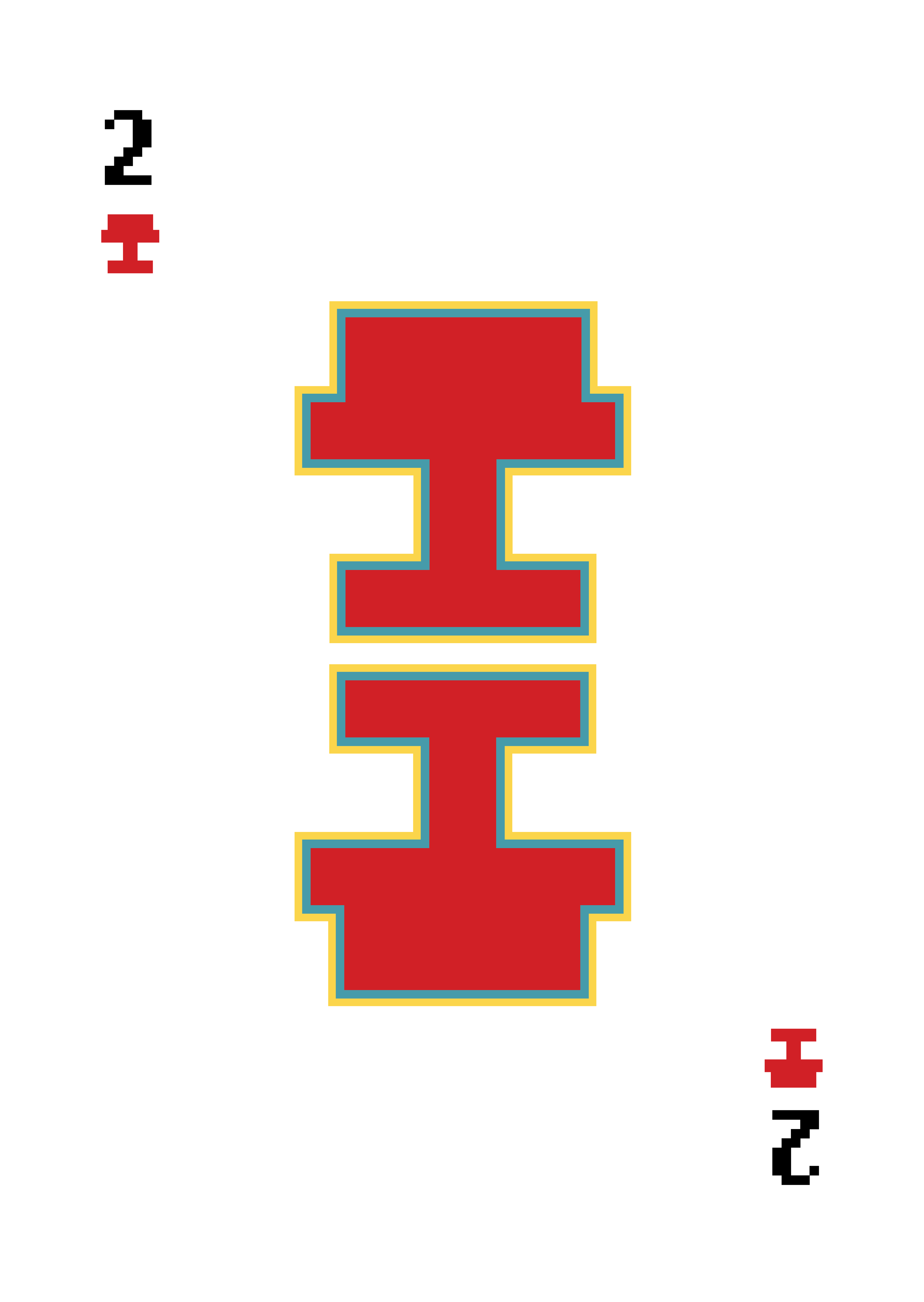
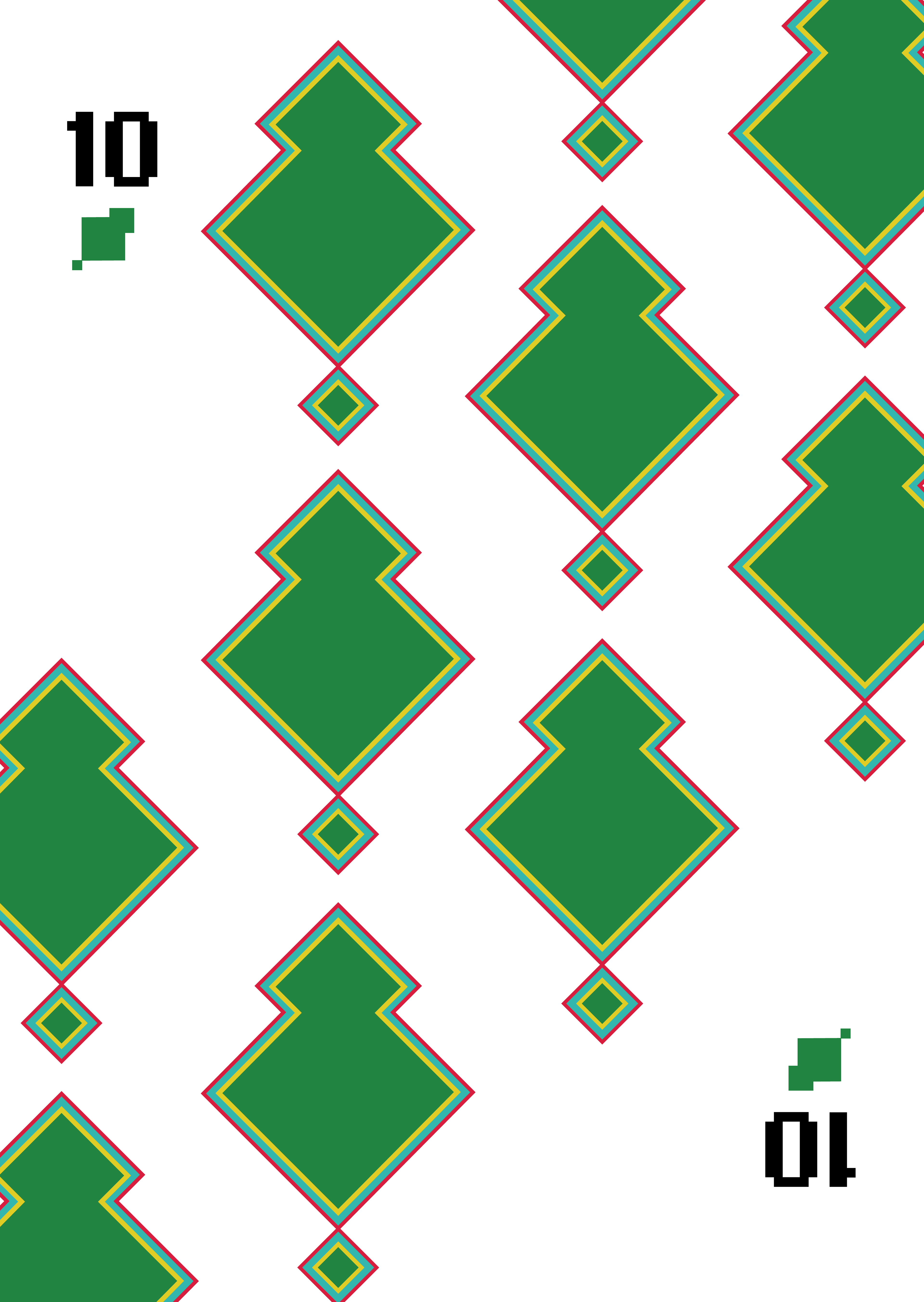
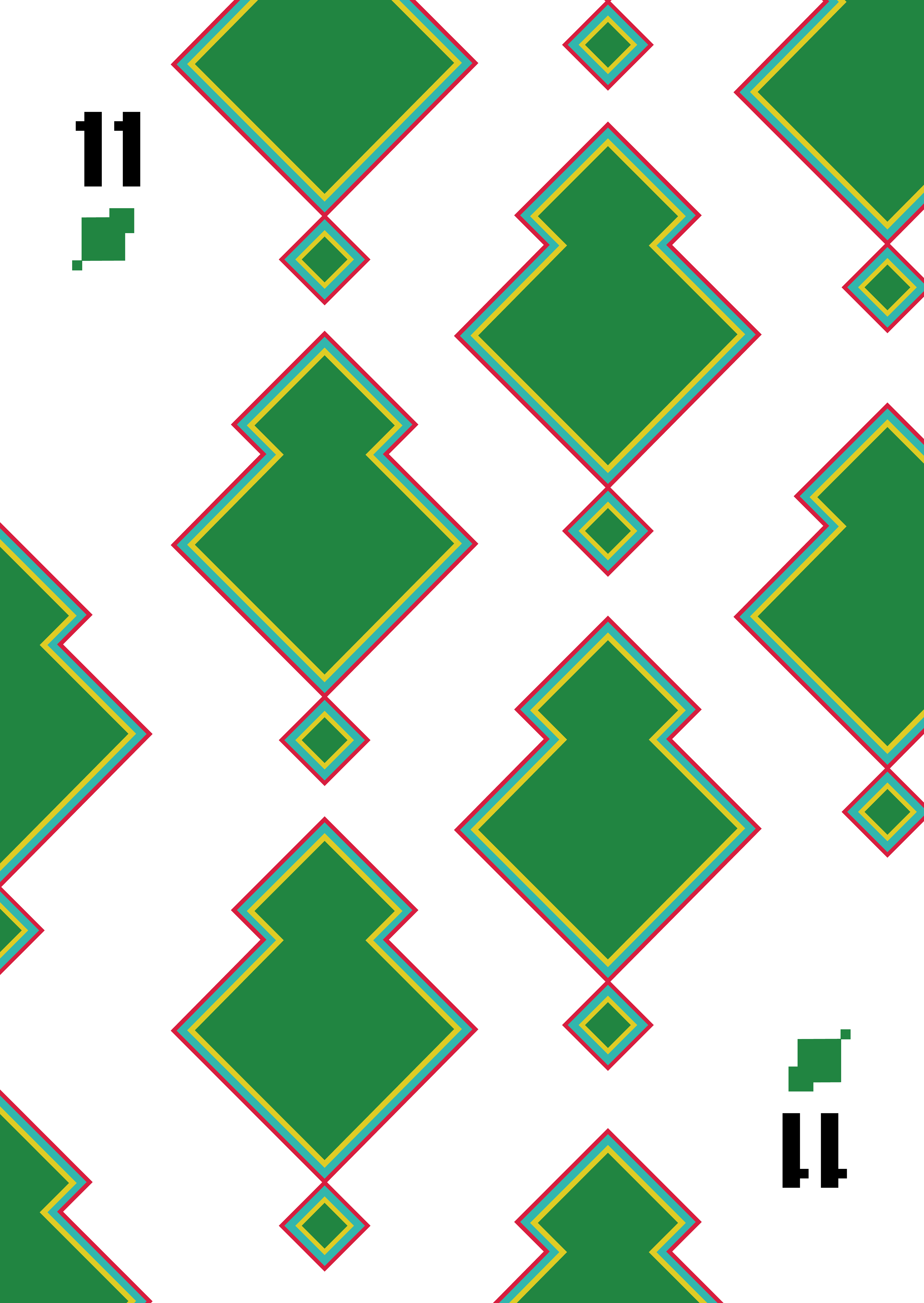
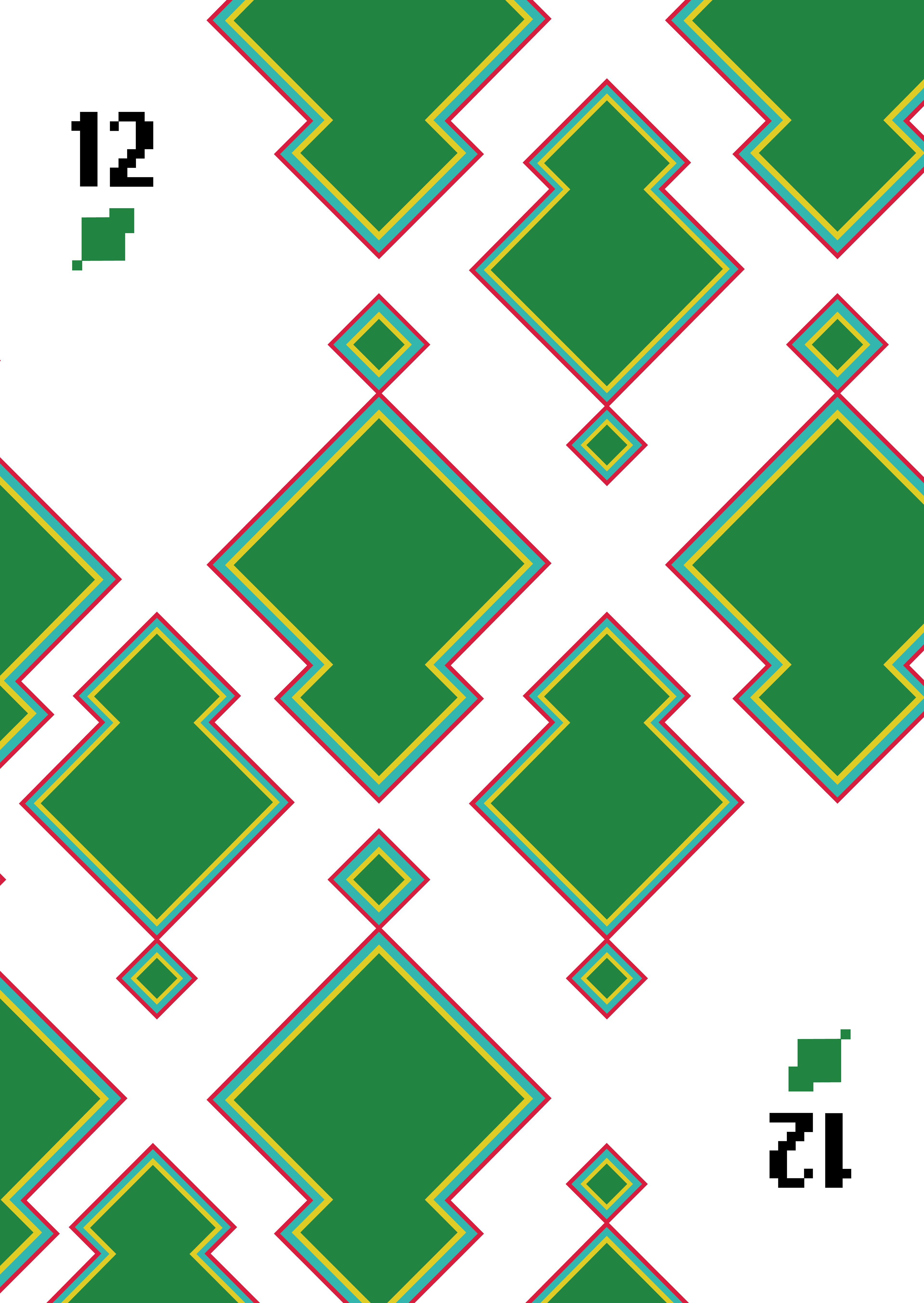
When people first start is hard to remember which card kills which. So my project proposes an intuitive Truco deck.
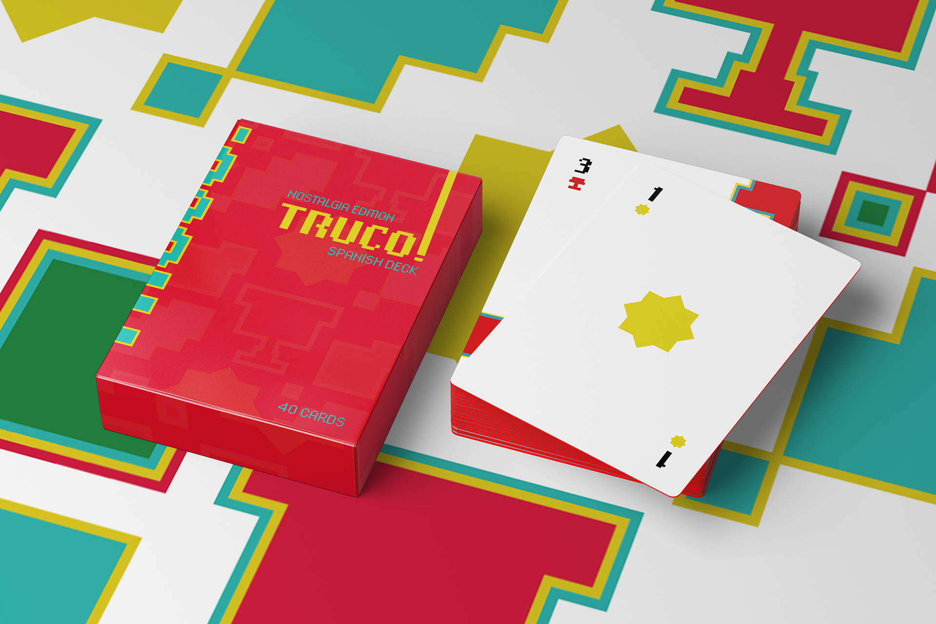
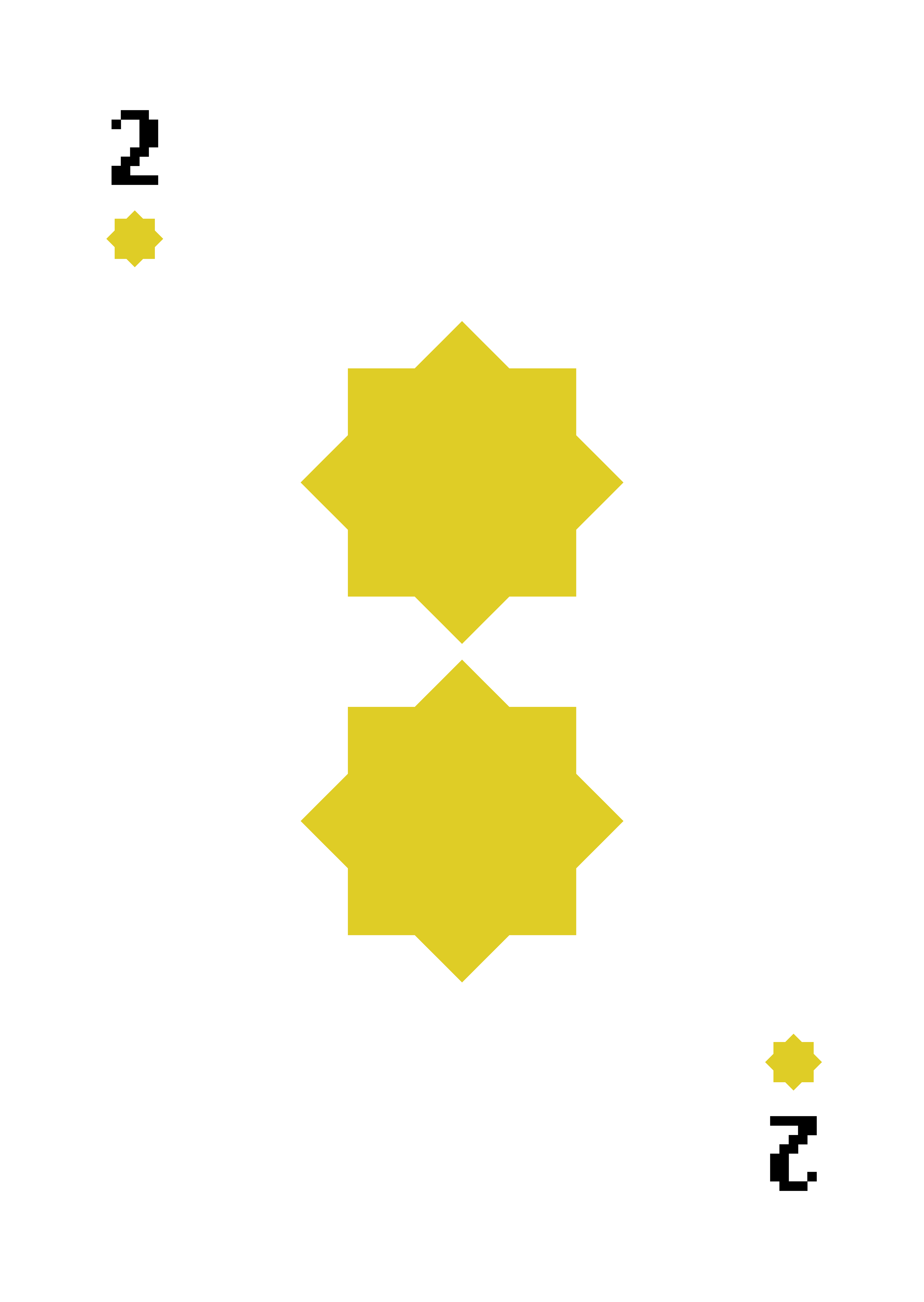
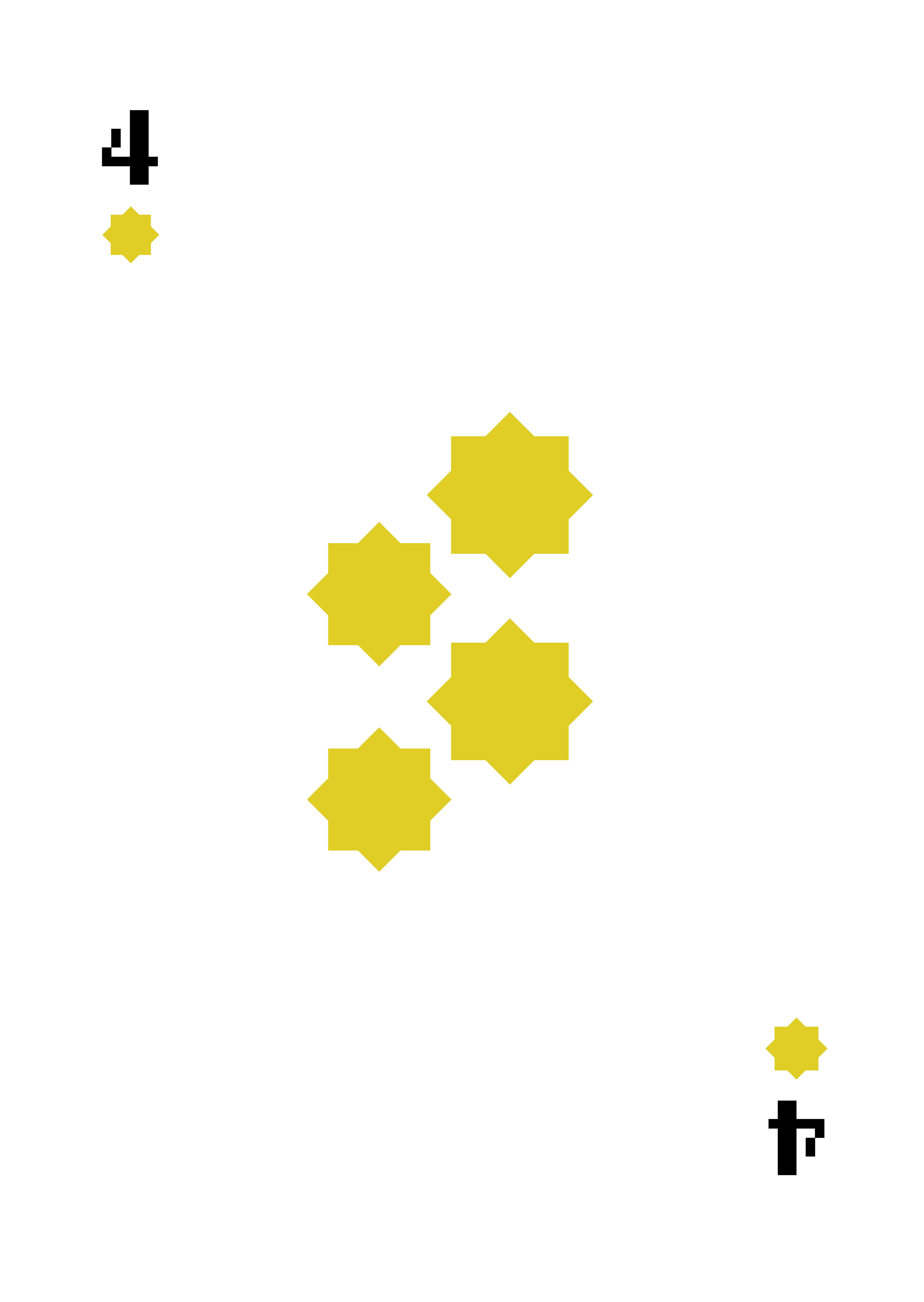
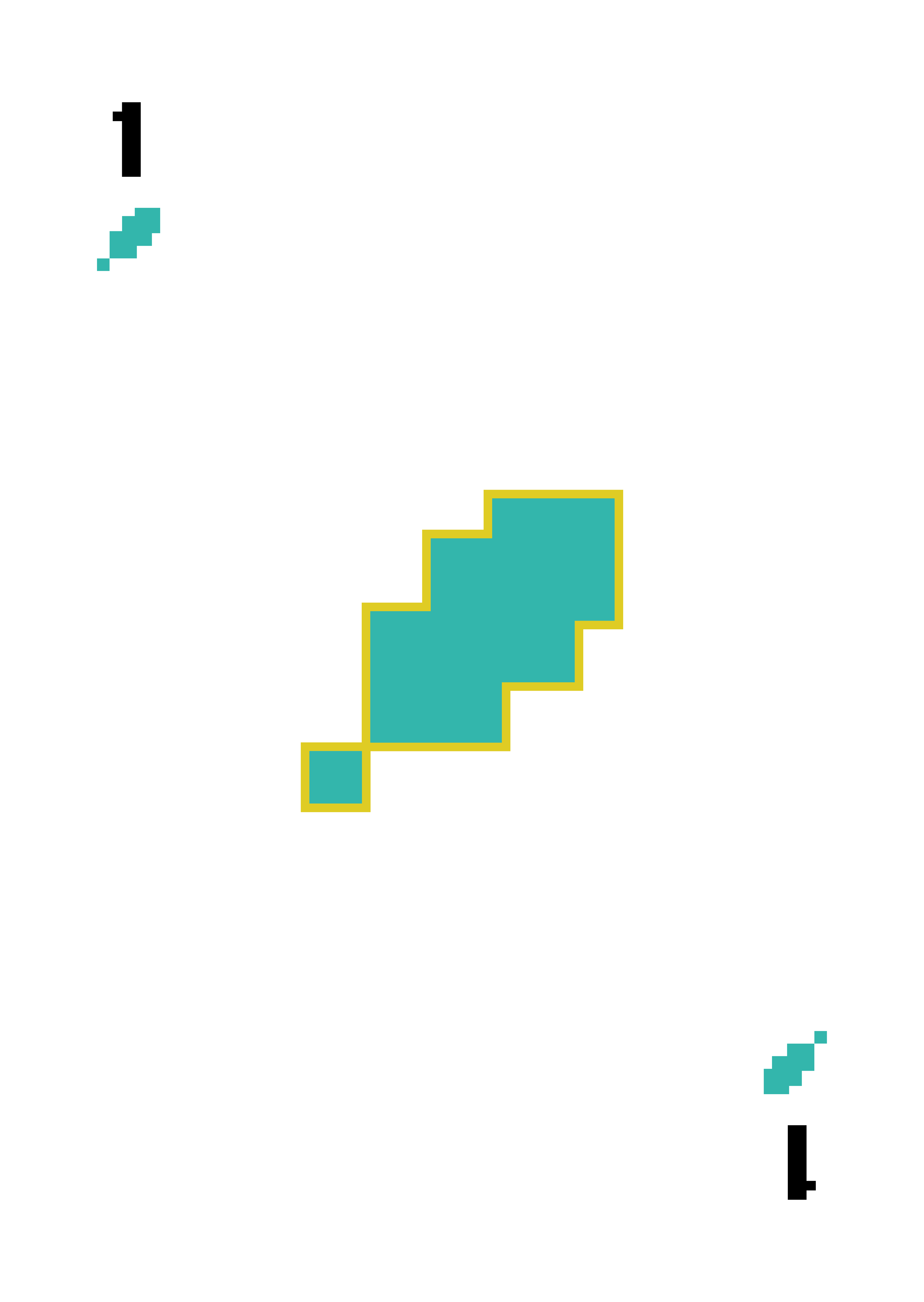
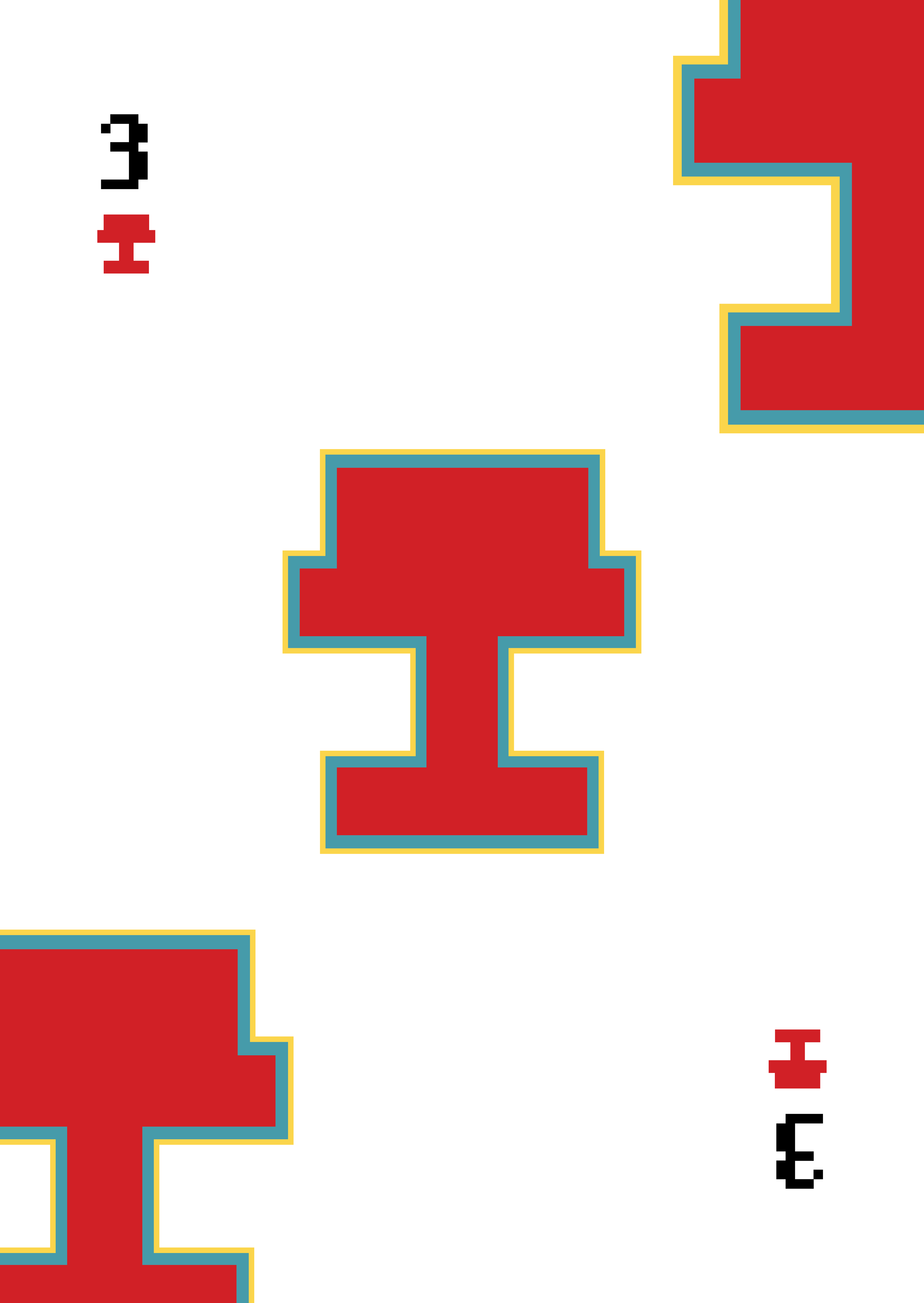
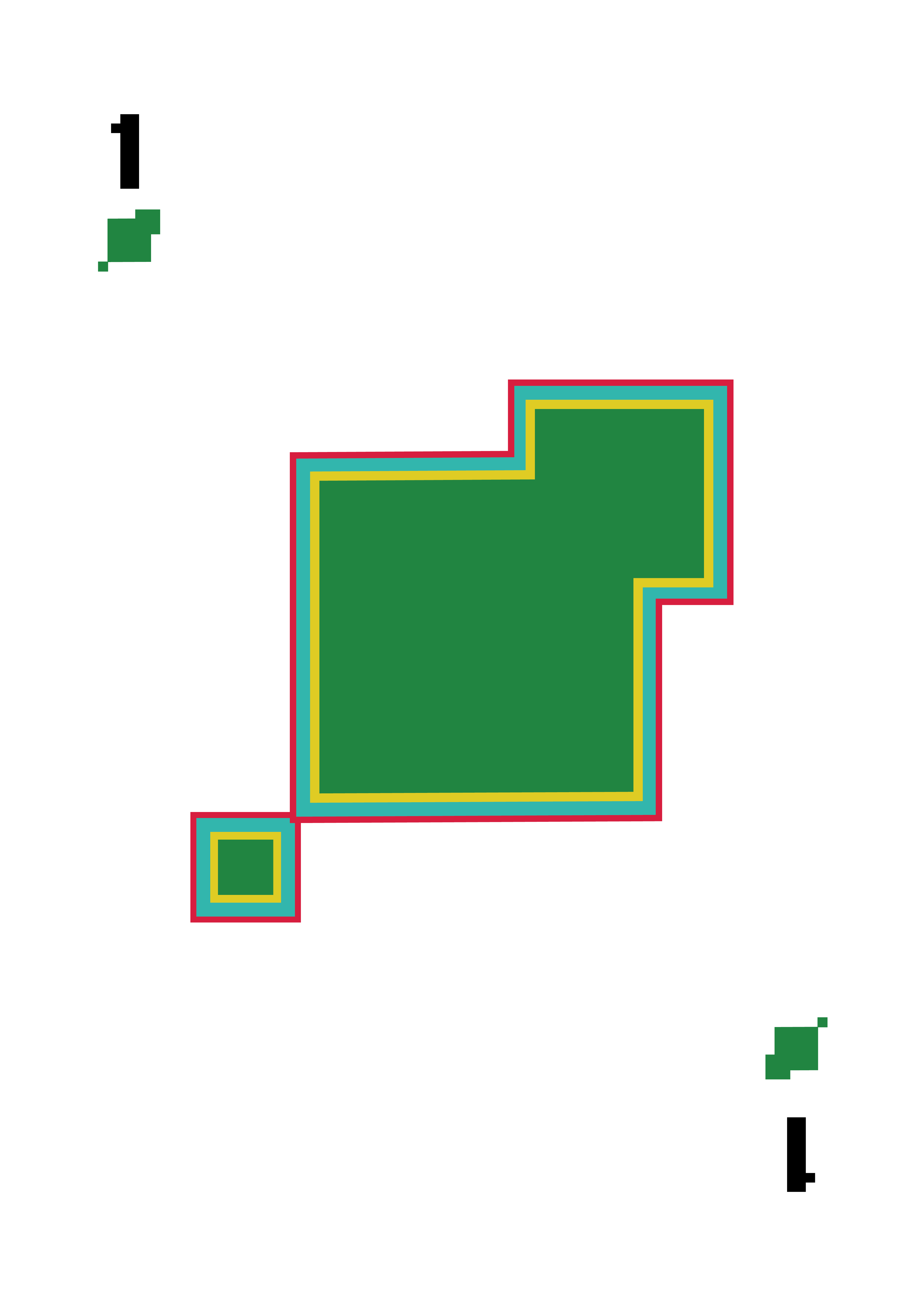
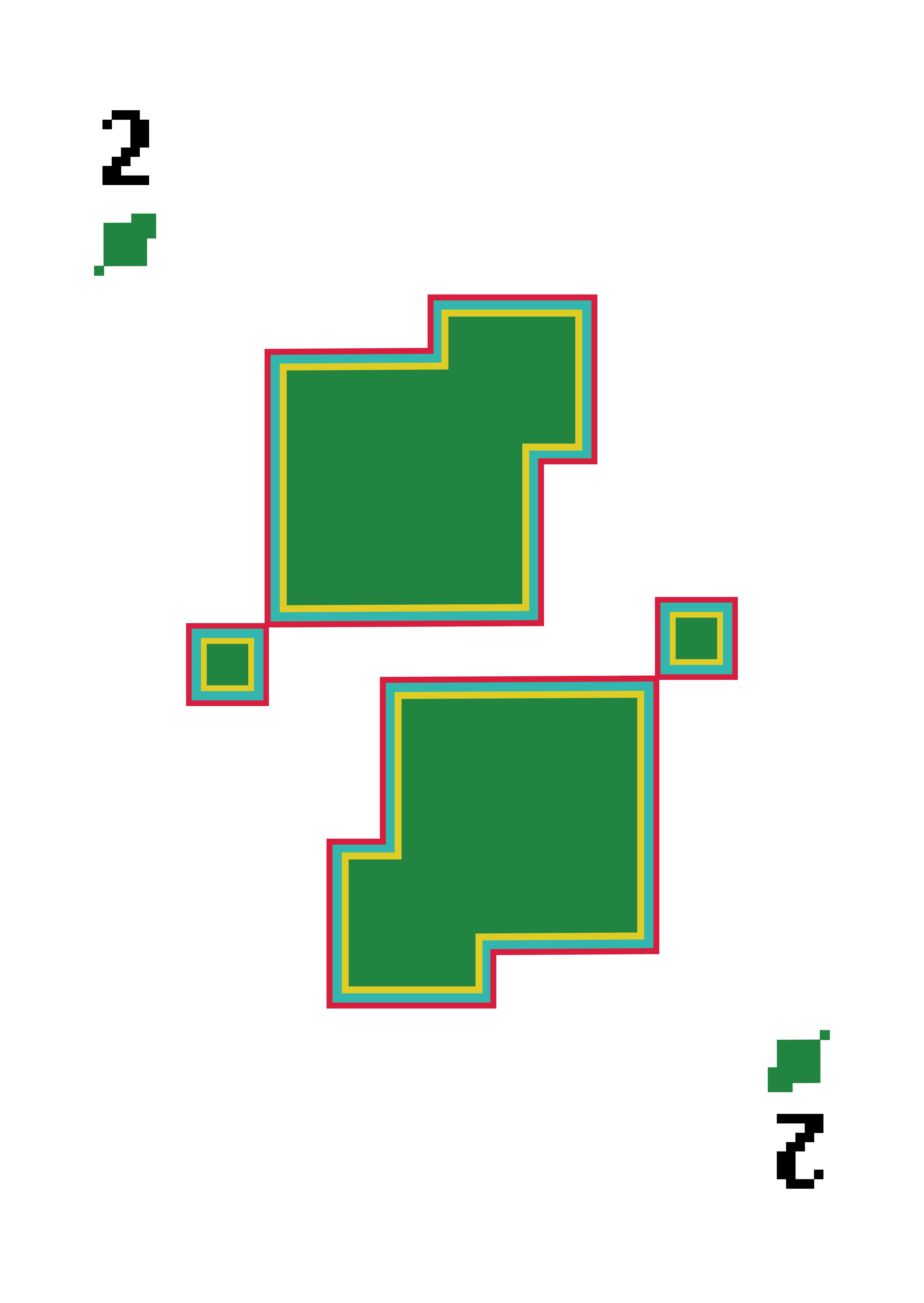
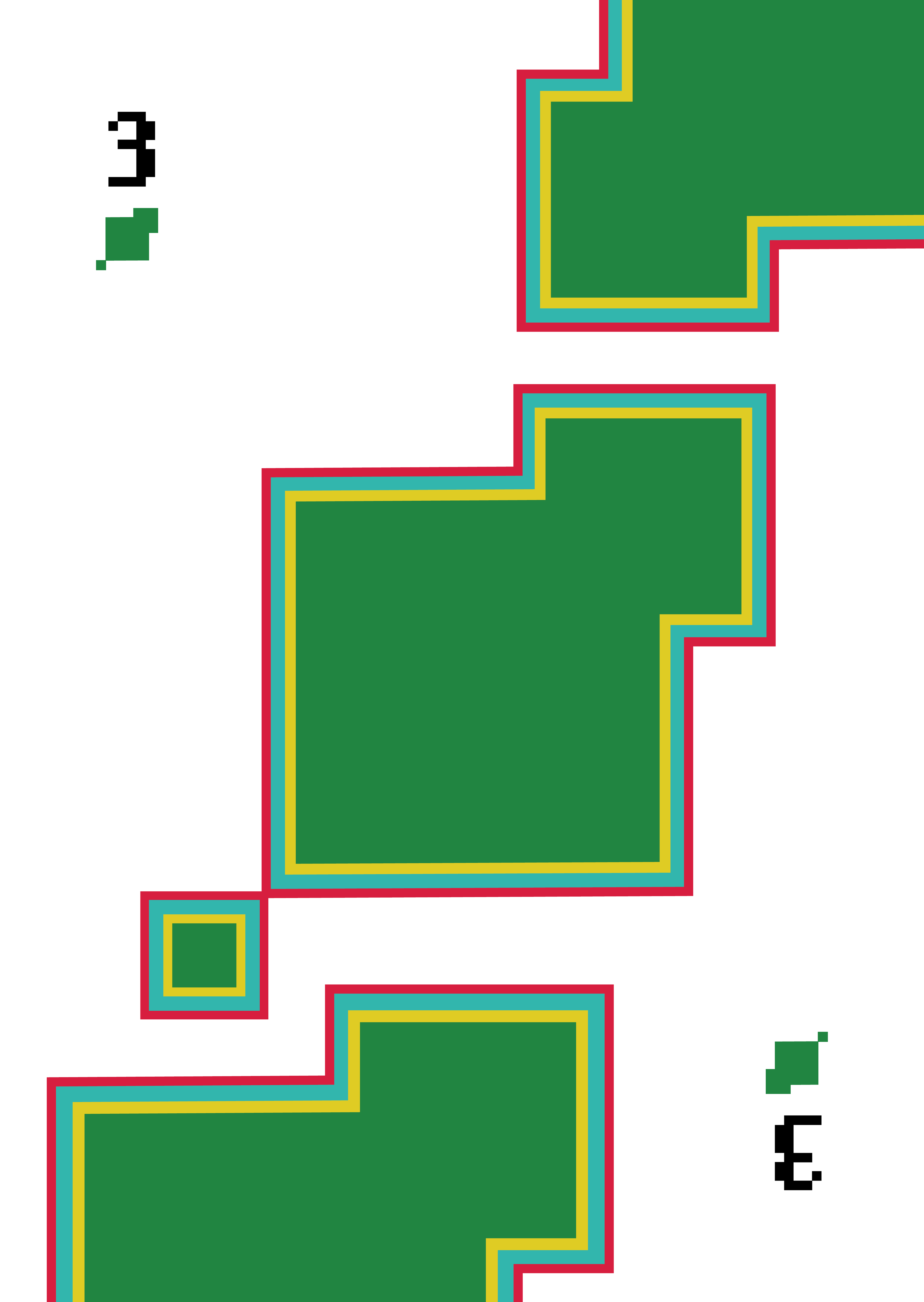
I got inspired by the old video games I used to play, that mimics the pixelated style. Abstraction needs caution, so the final project doesn’t lose its core, keeping it recognisable but way less detailed. I believe balance is key to great visual communication. There is no need for a card to be detailed, if it could be giving you unconscious guidance within the game.
The “Nostalgia Edition” evokes a warm feeling of memories while attributing a functional visual system.
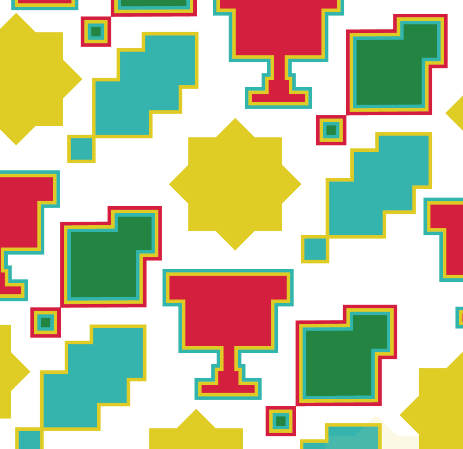
I decided to use the same colour palette as the original deck, green for clubs, red for cups, blue for swords and yellow for coins. The red does not represent the most powerful card in the deck, but I do believe is the colour that most represents the game: Strong, loud and vibrant colour.


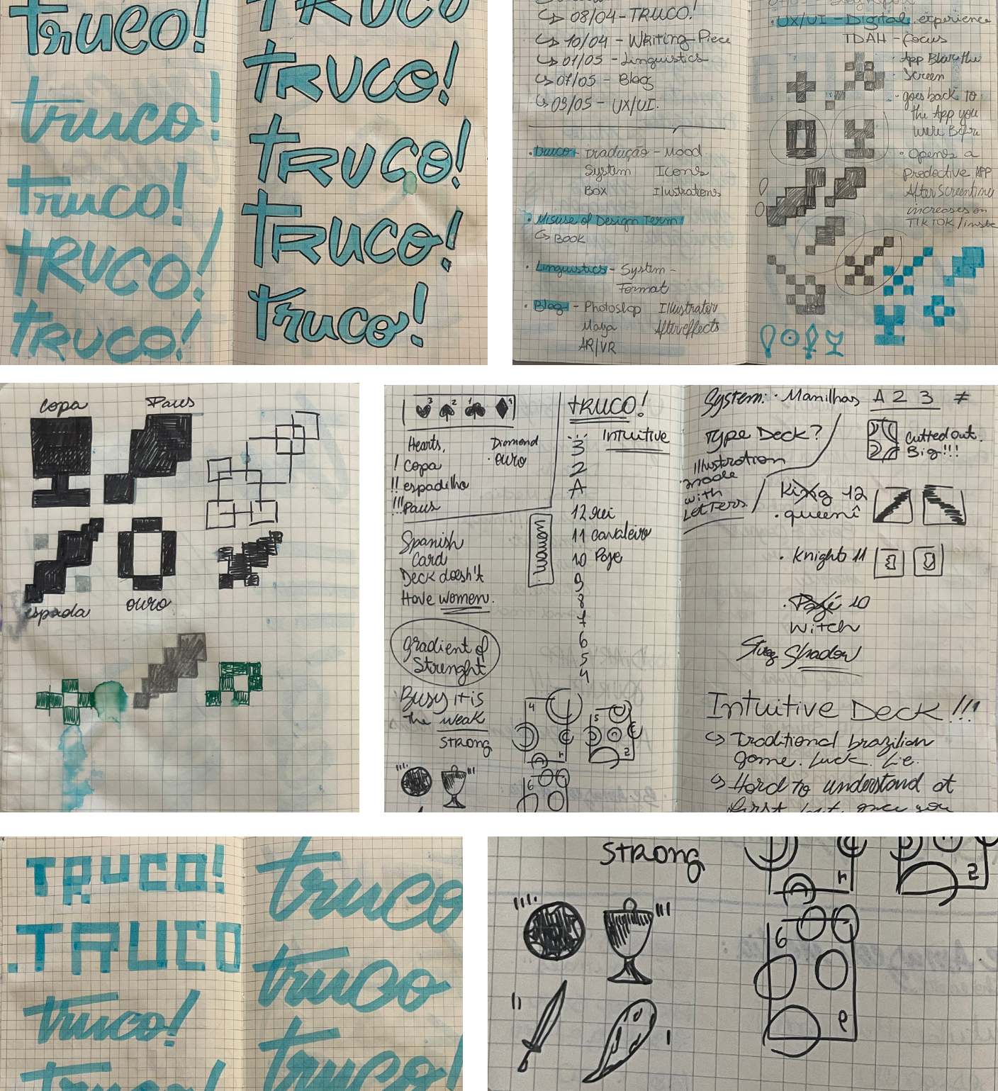
Process
I have created the symbols one by one by assembling a composition only with squares in Illustrator, after sketching them and exploring possibilities on paper since it is much more dynamic and faster. For the logo, I started looking into cursive writing to represent the game’s dynamism and quick response nature. That then evolved to choose a pixelated font, cohesive with the overall aesthetic of video games. It is called Lo Res OT 12, using bold and regular variations.